My Garmin chest strap finally died. Originally bundled with the 920XT I purchased back in August 2015, I’ve been using the HRM-RUN on average three or four times a week without issues, but after two intermittent failures during road rides this month she finally shuffled off to the big gym in the sky. I’ve ordered some cheap but well reviewed aftermarket replacements, but they’re stuck in delivery limbo thanks to the coronavirus, so I’m having to make do with the optical heart rate (OHR) on my Fēnix 5 for now. And it’s not very good.
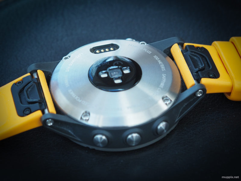
One of the main reasons for me upgrading to the Fēnix 5 was the inbuilt OHR sensor, but some basic back-to-back tests conducted shortly after buying the device in January 2019 proved unsatisfactory and I carried on using the chest strap for all workouts … until now. Still, every cloud has a silver lining, so I’m using this opportunity to compare the OHR to the chest strap by pitching my current exercises against some historical norms recorded on the same courses.
Comparisons
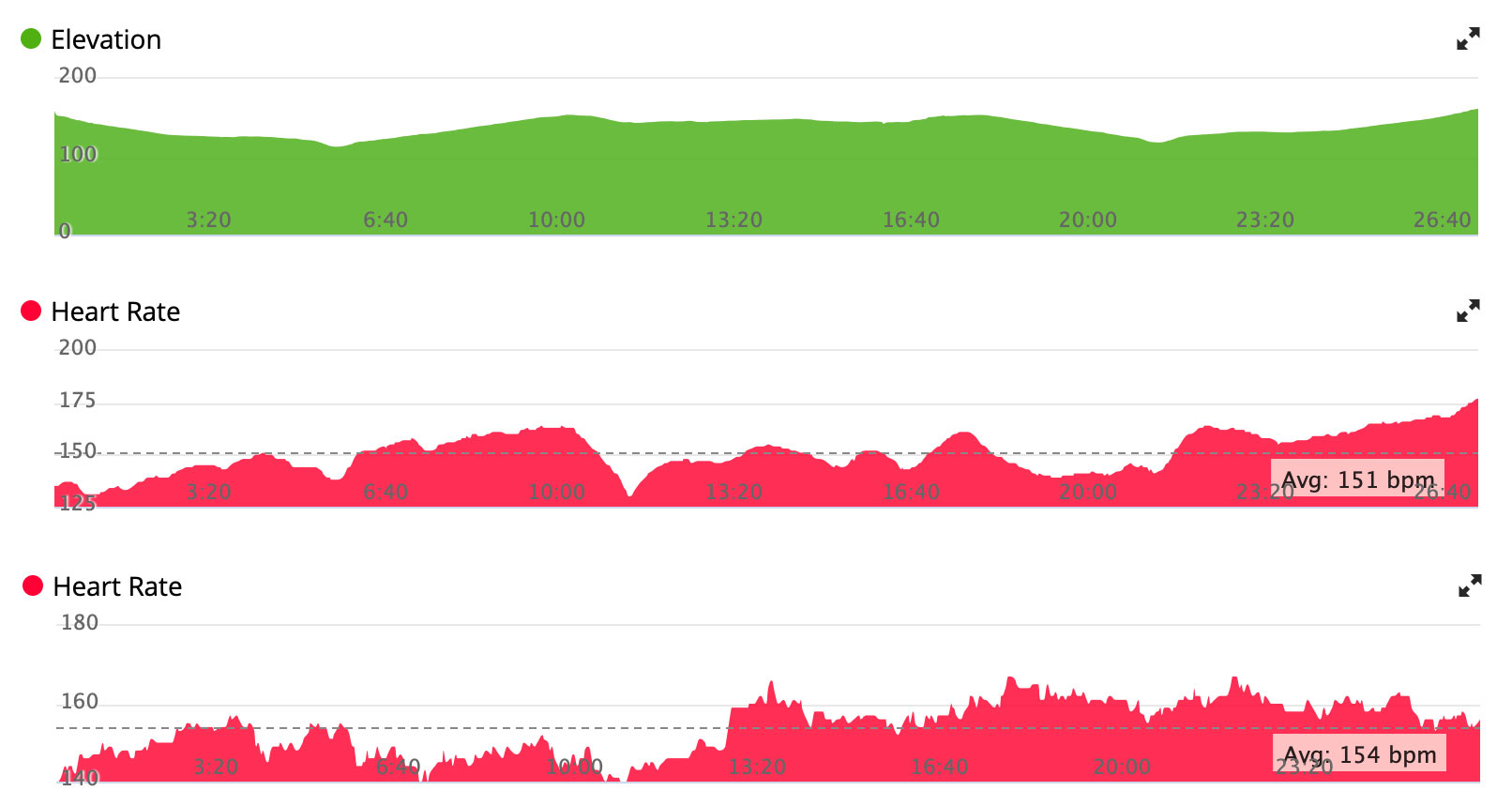
I’m going to focus on three courses here, because I run these circuits all the time and have plenty of saved activities to serve as control samples, all recorded recently using the chest strap HR monitor. Because I look at my heart rate now and then during exercise I have a good idea how my body responds to load, and while I can’t quite guess the exact beats per minute at any given time I can usually guess which of the five heart rate zones I’m in – something which has led to a few raised eyebrows when using the OHR.
Governor’s Hill
This is my go-to 5km circuit regardless of weather, because it’s all on pavement. I usually start with a gentle flat section to warm up before climbing gently uphill for a lap of a large residential area. About halfway round there’s a steep hill followed by a long downhill, and I finish with a progressively steeper climb towards home, always peaking at 170 – 175 BPM towards the end.
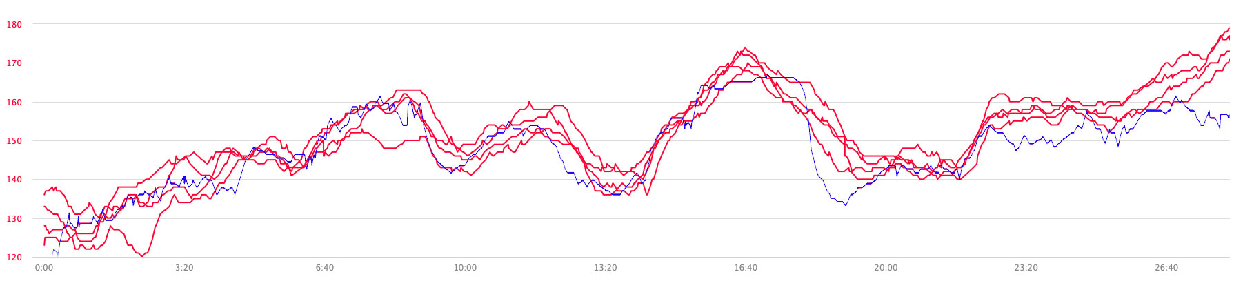
The red lines on this graph represent my heart rate using the chest strap, and were taken from recent activities on this circuit. All are fairly close together except one near the start, which shows where I had to wait in order to cross a road. The blue line represents my heart rate as measured using OHR during a recent run, and while it follows broadly the same pattern it doesn’t read the higher loads accurately, hitting a plateau during the steep, sudden climb in the middle and pretty much ignoring the progressive longer climb at the end.
I was pretty disappointed with the OHR towards the end of my run; I’m always in Zone 5 at that point and looking down to see the Fēnix telling me Zone 3 as my lungs are about to burst is not what makes you feel good about a £749 fitness tracker. I also wondered what that would do to my ongoing metrics in Garmin Connect. Would I end up overdoing it if I rely purely on OHR because my training load will appear much lower than it actually is? Or would Garmin think my fitness is peaking, because I’m obviously exerting much less effort than before and still managing to keep up the same pace? I definitely expected my anaerobic training effect to be less than that measured with the chest trap, since that’s based on the kind of sprint-then-rest interval cycles that the OHR struggles to measure accurately. But I was in for a mildly pleasant surprise.

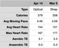
Having pulled some relevant stats from a couple of previous runs, again on the same circuit, I can see that there’s really not that much difference in the recorded figures. In fact, the variance between my OHR run and the previous two strap runs is less than the last strap run on April 1 and that of March 7 – both at identical average pace. OK, so the table doesn’t show how many threshold / rest cycles I went through (probably more on March 16 and 7) but the interpreted results are clearly not as bad as you might think by looking at the graph.
Section of School Road
Another all-pavement circuit I run often takes in 150m elevation gain over 7.5km, including two steep climbs, which I track as laps in the hope that one day I’ll be able to compare them and gauge my progress. Again I’ve got a wealth of saved activities on this circuit, and again I’m going to compare the most recent runs with my chest strap against a run taken with OHR measurement, but this time I’m going to focus on one small section: the first killer climb. Actually, it’s not that bad. There’s probably only around 40m of elevation gain over a maybe 300m distance, but I tend to shuffle up there as fast as I reasonably can, having just enjoyed almost 1km of gentle downhill on the approach.
Once again OHR is pretty much ignorant of the smoother changes in heart rate, leaping up in 10 bpm steps once it’s figured out that load is increasing, but topping out just below 150 when it should be pushing 165. It’s still reading 150 as I crest the hill and reduce pace, only now it’s 10 bpm too high rather than 15 bpm too low. Pretty disappointing when you put in so much effort.
Clypse Reservoir
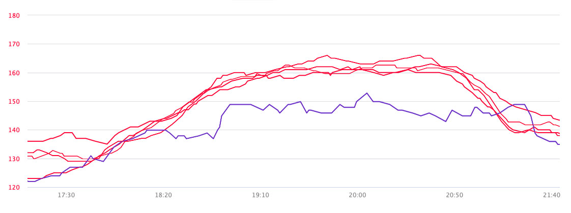
For the last comparison I’m heading over to the reservoir again, because it hasn’t rained here properly for about 4 weeks now (surely some kind of record) and the ground is nice and dry. This time I’m going to include some elevation data next to the HR comparisons so that we can correlate increases in pulse rate to increases in elevation. Maybe.
The first HR graph represents data gathered with the chest strap, and maps across pretty well to the elevation graph; gentle increase at the start as I warm up downhill, gentle increase as I climb back up, levelling out as I find my pace on flat ground around the pond. Coming home there’s a gentle decrease as elevation drops, before building up to 175 as I climb the final hill.
The second graph represents OHR and it’s all over the place. At the start I’m straight into Zone 2 without an apparent warm-up, it misses the first climb altogether, then perks up for no reason whatsoever on flat ground, before hanging at around 160 bpm for the rest of the run, completely missing the final climb and actually decreasing when I should be well and truly in Zone 5.
The overall figures do show similar training effects, but the OHR run lacks what little anaerobic workout value should have been gained by incorporating a couple of hills into an otherwise flat run, relying instead on broad-brush fitness measurement based on average HR and pace.
Conclusion
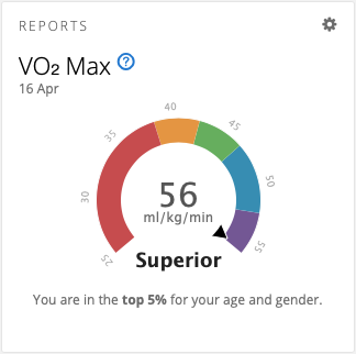
I can’t wait to start working with a chest strap again. OHR is probably acceptable if you train at a constant pace on flat ground and don’t expect too much anaerobic feedback, but I like to run in the hills and want to see what my body’s really doing. OHR doesn’t deliver the goods when it comes to subtle or sudden variations in load, and it doesn’t even track a constant high load very effectively. In the few days I’ve been without my chest strap my VO2max has been steadily climbing, possibly because I’m covering the same distances at the same pace but with apparently reduced HR activity.
I’ve sometimes wondered how many people have bought into Garmin’s marketing and are exercising solely with their wearable device, happily accepting whatever results that provides without questioning accuracy. Maybe they always exercise at a constant pace. Maybe they don’t have hills. 🙂
